I should really learn to pay attention
I finished my second Koolhaas hat somewhere in the wee hours of the morning when I couldn't sleep. The first one I did is the heathery purple one on the right, and I liked it so much that I made a second (the bright red on the left) as a thank you gift for one of the musicians in my recital last month.
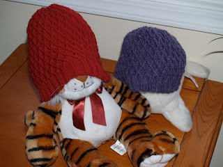
Now, I say I "liked" the first one because the pattern is really cool, but I noticed it didn't fit me so well. It was a little short. And I knew I had royally screwed up the decreases at the top because my stitch count was way off from the pattern. It wasn't my imagination:

That purple one is definitely shorter. The reason? I wasn't paying attention to the pattern repeats and left one out. The decreases are definitely wrong. Why is that? Because the first time I misinterpreted "k2tbl" to mean "Knit 2 together through back loop" rather than "Knit 2 consecutive stitches through back loop." Hence, I decreased way too many too soon, and the sad thing is, I didn't figure it out until 3:00 this morning when I was doing the decreases on the second hat. Fortunately, there are no flaws in the one I'm giving to someone else.
--------------
Further evidence that my brain is misfiring a little:

The other day I got a few skeins of Berroco Jasper, a soft single-ply merino that self-stripes. This, too, is intended for a thank you gift (yes, I'm a little late with all these, but I'm hoping to get them sent by the winter break). I originally intended to make the zigzag scarf by Debbie Bliss (from Scarf Style), but somehow got distracted by Dashing (fingerless mitts from Knitty), and now I can't decide which I like better. Dashing will probably go faster, but not everyone is a fingerless mitts type person, so the scarf would be safer. I think I'll finish one mitt and then make up my mind. Thoughts, anyone?
Sorry about the bad lighting in the photos, by the way. The days are short and it snows every other day, so the sun is scarce.


Comments